The Brief
Like many startup companies, Old Street Publishing had put a lot of emphasis into their business plan of having emerging authors and ‘great reads’. Their brand identity however was hurried and ill-conceived and made no visual impact in a competitive market.
Our brief was therefore to conceive a memorable colophon which would have, first and foremost, visual impact on the spine of a book – vital when displayed on book shelves.
Our Solution
With a wide range of sectors being published, from fiction and film to military and art, we concluded that Old Street Publishing needed an identifiable and unifying visual brand.
The ‘O’ and the ‘S’ from the company name are cleverly interpreted in the sea-lion and ball logo, resulting in a witty, strong and immediately identifiable colophon.
The Success
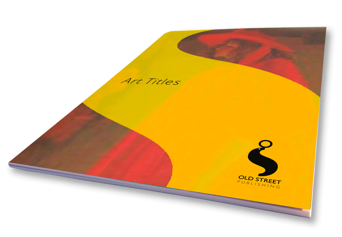
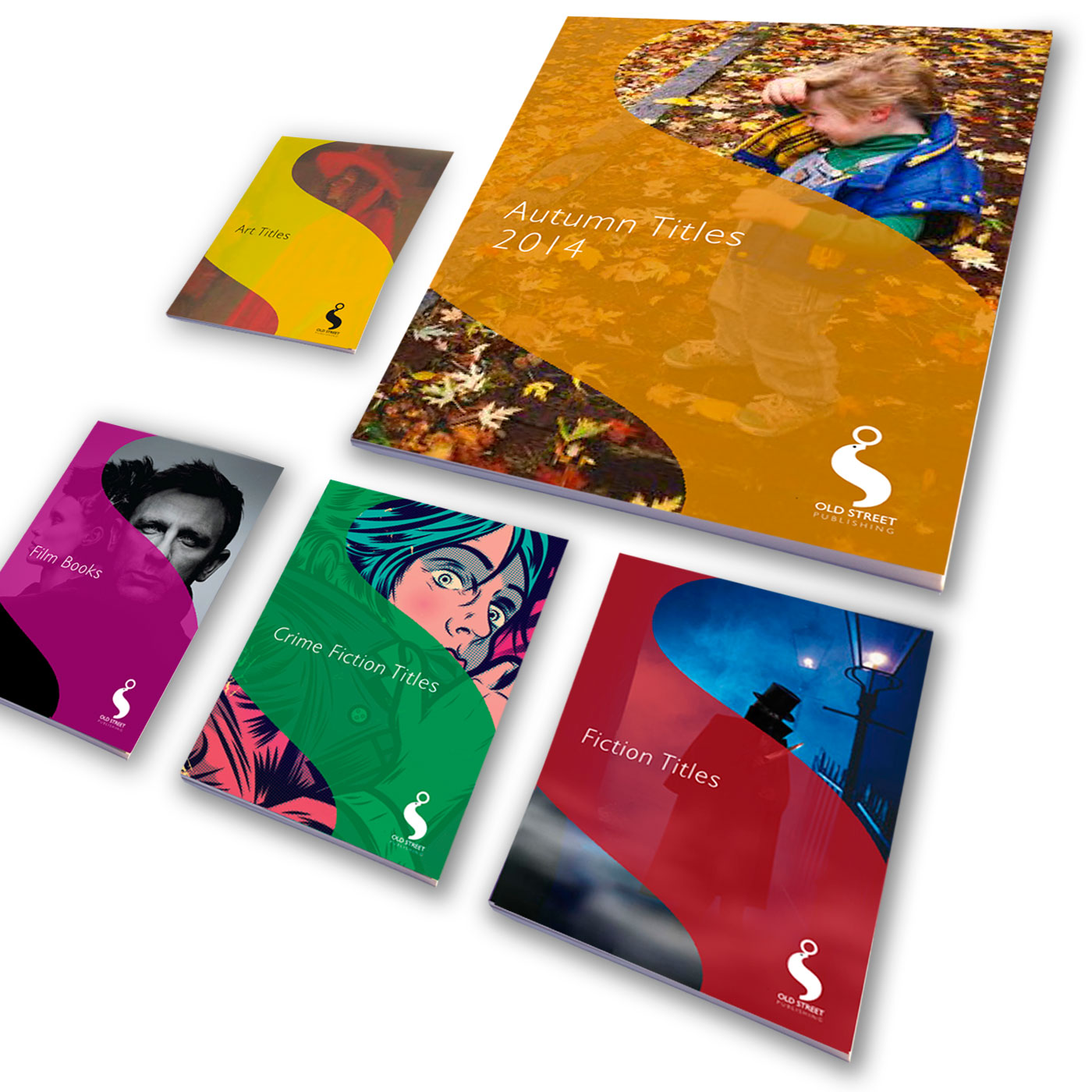
As well as playing a key role in identifying Old Street as a dynamic, emerging publishing house, the logo is utilised as a graphic devise across a range of marketing material, including catalogues, brochures and advertising in the likes of Bookseller magazine.
The distinctive curve of the ‘S’ moulds a secondary identity which visually holds together a diverse range of photographic and illustrative imagery.
The Mediums
Books are the key medium for maximum exposure, with a publisher’s products on display in major outlets on the high street.
Marketing and advertising literature have been given a strong visual link by way of the secondary identity, and the colophon is ideal for a strong social media presence.
Contact Us
If you would like further information on this particular project or have a similar project which you would like some help or advice on then please contact us here.
Why not sign up for the Yellow Hats newsletter?


